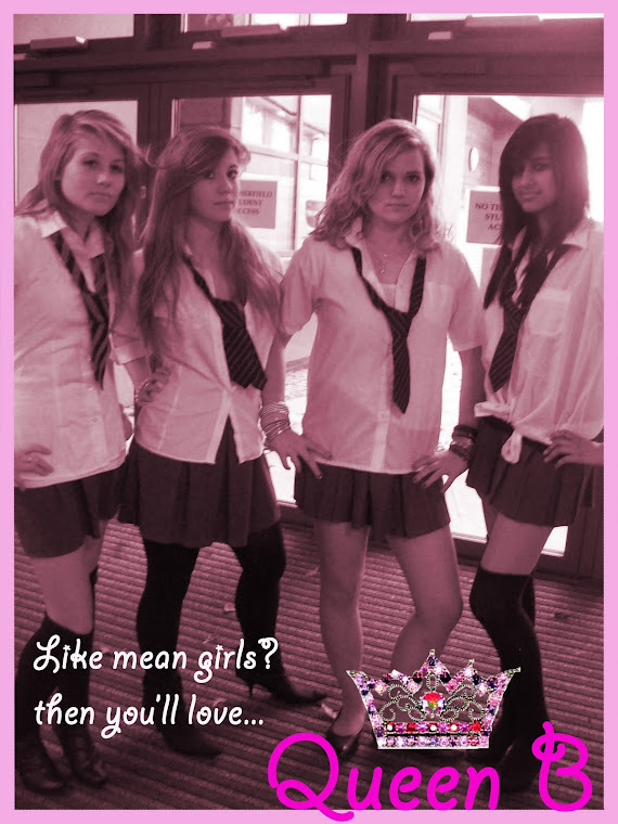
Monday, 26 April 2010

Evaluation: What kind of media institution might distribute your media product and why?

Here is our commentary, in this we have inter cut our actual film into the bit which we are talking about, we decided to do this because we thought it would be different to what everyone else would do

By Hannah Laura and Alana

Tuesday, 30 March 2010

Evaluation - Looking back at your preliminary task (the continuity editing task) what do you feel you have learnt in the progression?

Here are the pictures of our screen grabs between the two of our films, the preliminary task and the main task, underneath each picture I shall describe what I feel I have learnt between the two tasks.
Title Sequence
In the Title sequence of our Preliminary task we used a simple white font as we felt that this was the best font style and colour to use to fit in with the 'spooky' theme of our preliminary task. This compared to our Main task seems very basic. I feel that I have learnt a lot since our preliminary task as in how to use Adobe. Our Main task writing is curly, pink and a large font, this is very different to our Preliminary task. However I think that both of the font styles and colours suit the genre of our films (Preliminary task - spooky, Main Task - Chick Flick)

Shot Reverse Shot
Here we've used a shot-reverse-shot scene. In our Preliminary task there aren't a lot of these as the scene is very short, however with our Main Task there are quite a lot because we had lots More scenes where we needed to use a shot-reverse-shot. This shows the dominance of Natasha because she is being looked up on and Lydia is being looked down on. I feel that I've learned a lot between the two tasks in the means of Camera Angles as I now know how to use them them all effectively. So in this I think I've learnt quite a lot and I know what the effects of them are.

Match on Action
Here we've used some Match on Action. In our preliminary task we only used a little bit of Match on Action because like I said above the scene was very short and we didn't get many camera angles in, whereas on our Main task we had more time to experiment with the camera angles and use them effectively so again I feel I've learnt a lot from this.

Editing
In our Preliminary task we didn't really experiment with Adobe on what we could use for Editing, so we used just a basic fade in/fade out type transition for the editing. However in our Main task we had a lot more time to get a feel of Adobe so we used a lot more of the transitions, we were also learning how to use it whilst we were editing our film which helped us get a grip of what effects we could use.

180 Degree Rule
Here we've used a 180 degree rule which was one of the focus points in our preliminary task, I think we used this effectively within both of our filming tasks, I loved doing the film and I probably had to be reminded a few times to stay on the side of the 180 degree rule! But I know now that we have to stay on one side otherwise the audience may be confused on whats happening, so I think that this is what I have learned by doing this.

By Laura (:

Monday, 29 March 2010

Evaluation: How did you attract/address your audience?

Here is the annotations on our final product

By Hannah Laura and Alana

Thursday, 25 March 2010

Evaluation: Who would be the audience for your media product?

Here we have gathered some responses from our target audience. We decided to show some of the students from our school our film and then ask them to comment on their thoughts of the film. We decided to use a wide range of people within our target audience, this would give us a lot of feed back as to what could be improved or what really triggered their enjoyment while viewing the film. Another thing that we took into consideration was that we decided to ask people who were not our friends, therefore meaning they were not biased during their feed back.

Feed back that we have acquired:

Dan Rossell: 'Very good, editing is great, camera work is good and I like the fact you have included pictures as well as the video footage in your opening sequence :) You have used the 180 degree rule well. You also have an excellent use of sound as each piece matches up with the opening. Well done guys, good job. :)'


Amy Stewart: 'I like how you have started with the present and shown the story, then it goes back to 6 months earlier and how it happened. I also like how the music stops when the "she got with your boyfriend" line happens so it is emphasised. I also like the close ups show facial expression which is important in the story. I like the music you have used as it shows the genre well. The transitions work really well and make it seem more realistic. Costume shows the characters well aswell. Good :)'

Sarah Thompson: 'I thought that the film had a very unique way of starting. You could tell that it was a film that was meant for teenage girls. The writing was really cool how it appeared while people were still doing stuff, so you didn't get bored. I think that the sound was a bit dodgy in places and would need a bit of fine tuning, which would make it better. but I really enjoyed it :)'

Amelia Jones: 'I thought that the film itself was really good and the plot line was well thought out and it flows continuously throughout the whole two minute clip. The only criticism I can give of this clip is that the music in the background is sometimes louder than the dialogue which can sometimes make it hard for the audience to listen to the clip and what is being said. Altogether I think that this clip is very effective and it defiantly fits into the Chick Flick genre.'


By Alana Hannah and Laura

Wednesday, 24 March 2010

Evaluation - Who would be the best audience for your media Product?


Here I have found a picture of some teenage girls, I found this image on google.

I think that the stereotypical type of person who would come to see our media product would be a big group of girls, all quite skinny and body-conscious. I think that they would also be quite vain because mostly all girls are aware of their appearance and want to make sure they look good all of the time.

I think that their favourite colours would be a typical girls favourite colour, pink, and maybe some different ones such as purple blue and yellow. I think that their favourite thing to do would to go shopping and try on pretty clothes with each other, I think that another thing they'd love to do would to would be have sleepovers at each others houses and maybe watch movies and tell each other secrets.

I think that these girls would shop in high street stores such as New Look, Topshop, Dorothy Perkins and Primark, as I know many girls all shop in these places, I think the things they would buy would probably be High heels, bags, clothes and things which are pink! They might also buy accessories for their bedrooms such as pink fluffy pillows and pink fairy lights which would be draped across their rooms.

I would assume that the music these girls would listen to would be Beyonce, Pink, Pixie Lott, Lady Gaga, and other genres of poppy music, and maybe some R+B aswell. Their favourite Tv programmes would probably be the soaps and I bet that they would all be into watching them all and keeping up-to-date with them. I think another of their favourite pass times would to be to go on MSN and Facebook everyday so that they can chat to their friends and ask them if they saw the latest episodes of Hollyoaks Etc.
I expect that their favourite outfit would be anything pink and pretty, they would also be very conscious of their hair and make up and perhaps have pink handbags to check their hair and make up 20 + times a day in a little compact mirror.
I should also assume that they would be constantly on their mobiles, either texting or calling each other to share the latest gossips.
I know I've been very stereotypical here and I don't wish to offend anyone with this.
I should also think that their favourite films would be romantic comedy's and chick flicks such as Mean Girls, Notting Hill, John Tucker Must Die, etc, this is why I feel that they would be attracted to watch 'Queen B'
By Laura (:

Evaluation - What have you learnt about technologies from the process of constructing this product?


The pictures above show you the equipment and me standing by them, this is the equipment I've used for our media project, we also used Adobe premiere elements. Adobe was frustrating to use at times as it kept freezing and sometimes it wouldn't upload our film from the cameras we used, but we resolved this by either leaving it or trying it again later on to see if would work then and usually it did.
I feel that I've now learnt my way around the equipment we've been using, and I feel that I am more comfortable now using this then when I was during my preliminary task. Also, in our preliminary task we didn't use the microphone as we didn't know we could use it. After a few mishaps during our filming using the microphone we managed to get the hang of using it.
We used the tripod quite a lot during filming to make sure we had a still shot of many of our scenes. This worked effectively as the transitions are smooth instead of using handheld camera movements.
The camera itself was easy to use and we've always found this easy to use as you can easily pick up how to use this camera, I did quite a lot of the filming for the preliminary task and the main task as I found this the easiest, although all three of us did the filming, or had a go at the filming.
Altogether I feel I've learnt a lot from using this equipment and I am defiantly mo er confident on how to use this equipment
We also used YouTube and Free Play Music.com to upload our videos for people to watch and we used the free play music website to find music that would suit our film.
We had a few problems with YouTube and that we couldn't seem to upload a video from School as the network or Internet was very slow, again we had some problems trying to find the right music to fit our film, this was what probably took the most time during the whole editing process. It was also quite tedious.

By Laura (:

Evaluation: Looking back at your preliminary task, what do you feel you have learnt in the progression from it to full product?

Shot-reverse-shot: Match-on action:

Editing:

180 degree rule:


Looking back at our preliminary task I feel I have learnt a great deal about what goes into the makings of a good film. Before I didn't Know how much thought had to go into each camera shot, angle and movement. I have been able to put into our film all the experience that I have learnt in order to try and make our film as believable and as real as possible.

Within filming I have learnt how to use the equipment and how to manage to use it to my advantage. Each shot that we had story boarded we had to test to make sure that it would look good, if the shot did not fit then we had to change it. I have learnt how to use a shot-reverse-shot we used this within our conversations through the dialogue. By doing this I have learnt that by doing the shot-reverse-shot we are able to capture each of the emotions felt between the characters when they react to what is being said by the other character. This also put the audience into the scene and face the characters emotion with them, this also draws in the audience and gives the audience an emotional tie between the character and audience. Another thing that I have learnt was continuity through the film, in each scene I have had to remember where each characters position is, their facial expression and also the mise-en-scene. This allowed each shot to flow into the next making the movements seem smooth and as if they are happening once as well as real, this was a skill that I have learnt within the progression of filming. To help within the continuity of the film I have also learnt how to improve on the skills of match-on action


By Hannah

Evaluation: Who would be the audience for you media product?

Within our media film we have design many of the aspects according to our target audience. We have decided to go for a young female audience that we feel would most relate to our film and also be more encouraged to go and see it.

We first of all decided to do a chick-flick it was immediate to us that we would be targeting our film to a female audience. After looking at the options we then decided that a 'school life' chick-flick had been very successful in the past such as Mean Girls, Wild Child and Angus, Thongs and Perfect snogging. We had an idea of what we wanted our film show and make our audience feel,and so by enlisting young females to play our roles, having characters that we thought our audience could relate to and by also having familiar setting (a school), that our film would be very popular with this type of audience.

Above is an example of what we think our target audience would be like. researching and also looking at a stereo-typical girl of our audience we would expect them to be between the ages of 13-15 years old + or - a year. Girls within this age group would be expected to listen to music such as: Leona Lewis, Cheryl Cole, Britney Spears and JLS. A pattern is shown within these choices of music as they are mainly female artist and the typical 'Boy Band' that young teenage girls seem to go crazy over. Our target audience would be interested in programmes such as: Skins, Waterloo Road, sweet sixteen, Glee and 90210. Again we see a pattern emerging as most of the characters involved are of the teenage years and also many of the programmes are set at school. This gave us great hope that as the programmes and movies also aimed at this audience and had great success ours would too. Girls of our audience would be generally shopping at places such as: New Look, H & M, Claires, Top Shop and River island which are just a few examples. Our film includes some of the most important aspects within the things that a teenage girl has within her life, this would create more of a relationship between the film and the audience creating an attraction that would lead them to come and watch 'Queen Bee'.

By Hannah

Evaluation: Who would be the audience for your media product?

The audience for our opening sequence would be young teenage girls who enjoy watching films where the reality for them could also change like the girls in the films.
These girls would be the type of girls to be rather girly and like to do girly activities in large groups. They would most likely shop in places such as new look, Miss Selfridges, Topshop and Dorothy Perkins.
The music we have used in our opening sequence (pop tracks) is the music we would expect our target audience to listen to. Something lively and something they can get up and dance to in their room. Artists such as; Cheryl Cole, Pixie Lott, The Saturdays and The Sugababes.
Our audience wouldn't really watch much television as there aren't many programs that would attract the young teenage audience apart from Skins, Glee and Tracy Beaker.
I think they would watch our film because the audience would be able to related to at least one of the characters in the film. Also, because we tried to make our film fun and fresh I think that this also attracts the the audience into watching the film.
Also from my own experience, girls like to watch films where others get bullied to make themselves feel better and feel that they have less problems to deal with because they keep relating themselves to a character.

By Alana

Evaluation: What have you learnt about technologies from the process of constructing this product?

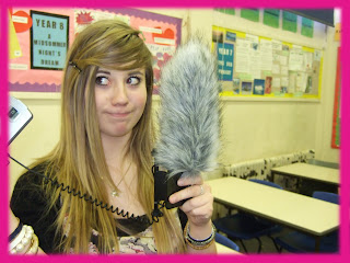
Here are pictures of myself with the equipment we used to film our opening sequence.
My skills with using the video camera, tripod and microphone have obviously grown as this is my first time ever filming. I've learnt how to get the best footage from placing the camera in different angles on the tripod and zooming in or out to the right distance.


I also used the programs; Adobe Photo shop and Adobe Premier Elements to help make our final product. These programs helped us to use the technology we had to make the opening sequence the best we think it could be with the editing we used.
I also used a media converter online called
www.mediaconverter.org which was used to create the working title YouTube video into the right format so that the Adobe program could let it into our film making it look more professional.
I have also improved my skills with using blogger and learning how to put the embedded YouTube codes of the films similar to our genre and to also be able to put our final film onto our blog for other people to see.
By Alana

Tuesday, 23 March 2010

Evaluation: What have you learnt about technologies from the process of constructing this product?

Here I have taken some photos as to what I have used throughout the making of our film clip. Above I have used a microphone, we used the microphone to pick up particular parts of the dialogue within each of the conversations of the film. The microphone was great, as we could really hear the conversation above the background noise, by minimising the background noise we were able to have a realistic setting for our characters as well as having our audiences focus on the conversation before them. This also really added to the camera shots and both worked and complimented each other. We did have slight trouble with the microphone as sometimes we could not get the light to show when the microphone was on or off making it difficult to judge as to whether the sound was being picked up or not. On a few of the occasions while filming the party scene we really had some difficulties with making sure that the microphone was switched on, unfortunately the background noise was to severe that you could not hear the conversation in enough detail without being focused on the background noise. We therefore had to film the party scene 3 times. Another issue with the microphone was that when we plugged in the microphone to the camera, the microphone on the camera would not pick up sound. This meant that we really needed the microphone to work and pick up the key points of sound which we wanted in good enough quality that we could use within our film. On the whole the microphone was a key aspect in the technology that we have used.
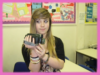
Within this photo I am holding the camera that we used to film our movie. We used the camera to record the action within our film, this included a variety of the shots, movements and angles displayed within our film. The cameras that we used proved to be very reliable and record much of the action in fairly high quality, although not in the quality that we would have hoped for with our film. If we had used a more expensive camera i believe that we would have really been able to improve the quality of our work however the camera had limits that we worked with and were still able to produce a impressive amount of work form. The camera we used mainly for the picture and the microphone for the sound however on some of the camera movements were not a lot of dialogue was spoken or we did not want to amplify any particular sounds we used the camera's microphone. The microphone on the camera again was adequate enough to use, however there was a lot of humming coming from the camera that we had to edited out using music and our editing equipment the make sure that the humming did not detract from the picture.

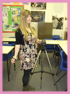
The tripod proved to be a life saver within the filming part of our media coursework. The tripod we used to attach to the camera and give a really impressive movement of the camera as the tripod had the ability to hold the camera steady while being able to move the camera at the same time. This enabled us to do a lot of tracking shots and also pans of our characters and location. While also doing this the amount of smoothness and steady quality was so great, that we rarely had to re-take the shot.
On the computer we used many programs that enabled us to edit, customise and perfect our film. We used Adobe Premier as the main source of editing. The programmed proved to be very basic to use and self-explanatory which meant that our group was able to affectingly begin to edit our film without having to stop and figure out how to do something. We did have some problems with Adobe as sometime while trying to up-load the content that we had filmed from the camera to the programme it took a few attempts to follow through and took a great deal of time. The quality of the Software was rather good throughout the editing the film, although sometimes the equipment did not allow us to be as precise as we would have wanted to make our editing as Sharpe as it could have been. Also the software makes the film (when running) sometimes jitter and therefore disturb the viewing of the film. To combat this we uploaded our edited film onto windows media this was a vastly higher quality than adobe and was greatly easy to upload onto our YouTube account, able for viewing by others. We created a YouTube account to upload our testing of camera shots and movements, exercising and getting used to the equipment, our preliminary task and also our final film. The YouTube account proved to be a very valuable programme as it allowed others to easily view our film and receive comments on it, which came back pretty positive. Blogspot has also proved to be the most valuable programme that we have been able to access and upload our coursework onto. Blogspot has been a very easy piece of software and we are so amazed at how accessible it was and how presentable our coursework is.


By Hannah

Evaluation: How does your media product represent particular social groups?


Here I have decided to talk about the easiest character that I can which is Lydia. I have chosen to write about Lydia as I was the one who acted as her. I took some of my inspiration from chick-flicks I had seen such as mean girls and Angus, thongs and perfect snogging. The characters of Regina George (mean girls) 'Wet Lindsay' (Angus, thongs..) and 'Kate' (Wild Child).


Regina George was maybe one of the most well known chick-flick 'Queen Bees'. Within mean girls Regina George is a very controlling and possessive character. Other characters see her as a 'plastic' as she has the perfect figure, face and personality. Lydia was someone as early on as we can remember we wanted to be a really popular and admired by all the girls and boys within her school. Regina was also the dominate teen within the trio within the mean girl group. The mean Girl trio were the top of the school and were noted as the popular group. This is another thing we tried to demonstrate within our film. One of the differences with the two characters is that Regina George is American and so some of the language used by this character was not something we wanted for our British Queen Bee, to look for someone with a more British take we looked at 'Wet Lindsay' as she was British and also had the same status within the 'Angus, thongs..' movie.


'Wet Lindsay' was a key character that we looked at to get some of the more British school girl look that would be more appropriate for our British film. Lindsay was a really believable character and was very bitchy which was another quality that we wanted Lydia to have a bitchy quality to her, so the audience would not feel to in love with the character, but rather place their empathy with the character of Natasha. We wanted Lydia to appear as a very confident character who was comfortable with her life, that she was able to rule the people around her, so that she could manipulate the situation to her own climate. We saw a lot of this in the character of Lindsay. We used a lot of the influence of the uniform from the social group of Lindsay's. The low buttoned shorts, breast on show and very short skirt, demonstrated to use the ways in which we could accessorize our own uniforms to show the difference in social groups.


Both the characters Regina and Lindsay have two main followers which we again showed with Jasmin and Ellouise following Lydia around. I was particularly eager to replicate the relationship between these three characters, which i think we really were able to do with the dumb blonde, attractive brunette and the controlling alpha Queen bee.


By Hannah

Monday, 22 March 2010

Evaluation: How does your media product represent social groups?

I have decided to chose Milly's character, Natasha for my character representing a Social Group, I decided to chose Milly because she is the new girl in the School where she doesn't know anyone and she doesn't know her way around this big new school.


This is Milly, before and after she was transformed by the Queen Bees.

Using Milly as a character means I can compare her to Cady Heron from Mean Girls and Poppy Moore from Wild Child.

This is what Cady used to look like before she was transformed. And this is what Cady looks like after she was transformed by the Queen Bees. Cady looks on edge in the first photo as Damian and Janis are the only people she knows, whereas in the second photo she was transformed by Regina, Gretchen and Karen. When you are transformed by the most popular girls in school everyone notices you, so then everyone knows you just because of the people she hangs out with. In the beginning of this film, the same with Milly Cady looks nervous about joining such a big school, as she doesn't know anyone, she then walks in to her Tutor room and Janis and Damian instantly befriend her, which is the same in our movie as when Milly joins the Queen Bees instantly snap her up and change her into what she is in the second picture. This again is the same as Mean Girls where Regina and her gang do the same to Cady.


This is a comparison between The Old Poppy, from when she first arrived at the school, to when she leaves the school finally settling into the school and making lots of friends. She looks really comfortable within herself. When Poppy first arrives in her school she finds herself sad being the outcast, as she is American and she looks down on the other girls, she also expects everything to be done for her. But she soon realises that she has to do everything herself, and the girls in her room start to help her. With Milly this is a difference as Natasha doesn't start life in a Boarding school. She comes from one though but she isn't stuck up or shows off, as she is nervous about being in a new school where she doesn't know anyone, but again, like Poppy she soon makes friends.
By Laura (:

Evaluation: How does your media product represent social groups?

This is Amy who played Ellouise.


This is Jas from 'Angus, Thongs and Perfect Snogging'. And this is Karen from 'Mean Girls'.


I chose these characters from other films because Karen and Jas come across as the dim characters of the popular group and this is how we tried to portray Ellouise.
The similarities are that they all have blonde hair which states the stereo typical stupid student and they are also all thin and pretty/self obsessed. Also the similarities between Karen and Ellouise is that they say things that they shouldn't, for example Ellouise tells Natasha Lydia got with her boyfriend, which is a very 'blonde' thing to do.
Amy's character is more similar to Karen from 'Mean Girls' as they are already a big part in the queen bee status group at school.
The differences though are that Jas from 'Angus, Thongs and Perfect Snogging' isn't actually in the popular group at school to begin with which is completely the opposite to Karen and Ellouise who are in that social group to begin with. The other difference is that Karen is an American character compared to the British atmosphere we went for.


By Alana

Evaluation: In what ways does your media product use, develop or challenge forms and conventions of real media products?

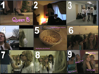
Shot One -
This is the Title of our Film
In this shot we decided to have the font of our title very pink and bubbly, we compared this to films such as Mean Girls and Angus Thongs and Perfect Snogging, who also use pink and bubbly writing. The shot is of The Queen Bees feet walking into an 'after-party' scene, when we screen shot this scene we decided to have just Lydia's foot completely still and not pixelated or blurry like the other 3 girls' feet. We decided to have this to again emphasise the importance of Lydia as she is the main Queen Bee. Also with our pink and bubbly writing this can then give the audience a clue into what the film will be about and what genre it falls into.
Shot Two -
This shot sets our location for the film
This shot is the establishing shot, it sets the scene of the party, as you can see the curtains and the sofa behind the characters. In this scene we have used lots of props to make the scene seem 'homely' as it was in the middle of the day we closed the curtains and tried to drape some heavy material over the window to make it seems darker, we then turned a few lights on to then emphasise the forced light in the shot. Also to make this seem homely there are pictures of Alana and her family around the place, as we filmed it at Alana's house. The characters are in dresses/outfits suited for their group, such as the Queen B's are in the best dresses, and then the Geeks are in typical Geek outfits such as a skirt/trousers, trainers and a Shirt and Jumper.
Shot Three -
This shot shows the Costumes and Props used in our Film
This shot is after the scene where Lydia and the two followers meet Natasha for the first time where Natasha is putting her schoolbag into the Locker, this scene shows lots of our extras. This shot is a pan shot, and it follows the action of Natasha being dragged from the Lockers into a side room where then the Queen B's then change her. We tried to film this scene with as many of our extras as possible to make the corridor seem crowded so that could portray that more people are seeing Natasha being dragged from the Locker into the side room. We defiantly used a lot of different props in this shot, such as the lockers, Jonny's school bag and the costumes also reflected well on this scene as everyone was wearing school uniform so this again tied into the British feel of this shot, as in American Chick Flicks they wear their own clothes which could personally identify them whereas in the UK we wear uniforms so it makes us all look the same.
Shot Four -
This shot shows the Camera work and Editing
In this shot we really wanted to capture some of our best editing and camera shots, This is the shot where the Queen B's are talking about the new girl who is starting school this day, this then cuts to a shot of Natasha looking anxiously up at the school to get her first impressions and then she says here we go, as she may be used to looking at new schools. We used parallel editing in this shot to contrast the two shots together, also in this shot there is a shot-reverse-shot which can also add to our list of shots we have used in our film, which then adds to the variety of them as well. In this shot we also wanted to capture the different atmospheres in the two shots, such as in Natasha's scene we see her feeling very anxious and scared about her first day at a new school, and in the Queen B's scene we feel that the atmosphere is much more relaxed but also has a bit of a 'bitchy' feel to it. We used a switch transition on Adobe to merge our two scenes together. When we were editing this section I suggested that we put the two scenes together to show the contrast between the two and thankfully it did work well together.
Shot Five -
This shot shows the Title Font and Style
In this shot we've chosen the very first shot we see after the opening, this is our establishing shot and the opening shot to the film, we used Giddyup font for this as again it ties in with our title, 'Queen B' which is also in the font, we have also tried to use a very girly colour, pink, which is the favourite colour of most teenage girls which might again draw them to the film as the credits are very pink and bubbly. This is also like the film hairspray, in which the titles from that film are also bubbly and brightly coloured.
This font is also used further on to introduce our characters as we tried to keep the same themed writing throughout the whole film.
Shot Six -
This shot shows the Story and how the Opening sets it up
In this shot we decided to show Lydia and one of her followers, Jasmine talking to each other, Jasmine is saying 'Well it was a bit slaggy' in to which Lydia replies 'Shut up jasmine'. This is a important shot in our film because it shows the audience that there is a bitchy atmosphere. Also in this shot many of the teenage girls may be able to relate being in a 'Queen bee' situation, such as themselves being subjected to make decisions on what to say to each other when they both know a secret, and when the person who comes over asks what they were just talking about. I think that in this shot we've really been able to start to bring in the mise-en-scene of our film and then we can connote the girly feel of the scene, with the dresses and everyones hair and make-up perfect. Also, the Queen B's look perfect as you would expect them to do, perfect hair, perfect make-up, perfect figures, these are all very typical of a 'Queen Bee' status in school.
Shot Seven
This shot shows the Genre and how the opening sets it up.
In this shot we can see Lydia and her followers and then Natasha on her own, I felt that this shot did set the Genre as you can see the 'bitchy' girls in the background and then the poor innocent girl in the foreground, in this shot we could possibly say that as Milly is in the foreground she may be seen as important but in this shot it should be reversed, as the Queen Bees should be more important than a 'New girl' who has just started the school. In this shot we just wanted to get a good shot of the Queen Bee's looking at each other and we decided to do this looking past Natasha, as we could then see Lydias face, smirking at Natasha, she looks very mischievous and devious.
Shot Eight
This shot shows how the characters are introduced
In this shot we decided to look over Milly's shoulder, this can then show Lydia looking at her, she looks very content with herself as if she already know what she's going to do to change Natasha, also she looks as if she's already planned out in her head what to do. The position of her followers behind her makes her looks more important as a person and this is a typical Queen Bee position, as then her followers worship her and make her seem very important as if she is their idol. This shot is also where we see all three of our characters in one shot together, With Natasha at the foreground of the shot, which makes her seem more important.
Shot Nine -
This shot shows how Special Effects were used
In this shot we decided to use our shot where we introduced the characters for the first time, although there are no wacky special effects (because we didn't have any in our film as there were no need for them) the shot still shows our abilities to use the software package in which we were given to produce and edit our media (Adobe Premiere Elements). In this shot the music used to comply with the shot is effective and this can then introduce us to the characters to their music. In the later shots where the girls are walking into the bathroom with the mirrors we also use the same music along with this as this can remind the audience on who the characters are.
By Laura (:

Evaluation: In what way does your media product use, develop or challenge forms & conventions of real media products?


Shot 1: Within the first shot we introduce the title of 'Queen B'. we used a curly and very girly font (Giddyup) which was bright pink, really stereo-typing the colour that girls seem to love and be most drawn to. The large image of the font is clearly displayed on the bottom right of the shot. this immediately draws in our audience and also introducing our characters within the shot, although not introducing their feet. Instead the way that we decided was to use their feet, with the title below. I feel that this introduces the way that the characters are statuses within the film, almost standing on the title, reflecting their personalities and also social status within the school and party social environment.
Shot 2: In shot 2 to introduce our setting and location we used an establishing shot. Within the shot we have used a wide variety of mise-en-scene to really exuberant the scene in which we have placed our characters. We used the window to give the natural light giving a realistic setting, we also used the window as we get a great shot of the curtains and also the lampshade, table, sofa and pictures hanging on the wall. This gave the great connotations that the location was a house and the figures within the foreground of the scene are wearing dresses and drinking supposedly wine, again supporting the party beliefs.
Shot 3: Shot 3 we really wanted to show our mise-en-scene within one shot. We use a tracking shot to follow the action within the shot and also show a lot of continuity. We filmed down one of the corridors within the school, really giving the impression and reality that the film is set within a school and show that the displays and also lighting & props reflect the school atmosphere. In the shot we also have a wide variety of the extras that we used. Each extra was assigned to a particular social group. This was accentuated by the vast difference in the way the same uniform was warn by different people, different hierarchy in the social chain at school, that we have placed our characters at the top of.
Shot 4: Shot 4 we really had to try hard to get a stationary picture of as the transition between the two was so fast. This quick montage of conversations and parallel editing between the two main characters was so important to show the differences in the mood and context of the scenes. this showed the great divide and also the large contrast between the two characters as they are so different and from different backgrounds. We were inspired to use this type of editing for this scene through watching the trailer for 'Wild Child' as this really was shown between the two characters within that film. It was also a great way to cut to the main important parts of the events without having to show how the characters reach the result. The camera work was also really well adapted to the editing and also the scene. We used a wide variety of close-ups, angles and heights to keep the audience engaged and entertained (as seen between the transition of Milly and Amy).
Shot 5: Within shot 5 is a great example of the title and font size. We displayed the credits at the beginning amidst the action withing the shot. The camera is keeping within the action and so there is places for the audience to be entertained while reading and speeding up the action within the scene. We kept the font size large enough so the audience could read it but not too large and so the audiences attention is completely drawn away from the action going on within the scene. The font type was again consistent with the title (giddyup) this shows the link between the titles, credits and also the association with the film. ( We also included our font type within our film poster displayed on the blog).
Shot 6: We have used as an example to how our story opens. We have done it by slowing down the pace of the camera action and also quietening the music and so the dialogue is able to be heard. Within the dialogue the context of the film is put into place giving an introduction to the characters personality and relationships with one another. The story is also catalysed within the first two minutes getting the audience immersed in the scene are storyline. The position of the characters also gives a very good representation of the way the camera interacts with each of the characters.
Shot 7: In shot 7 we really started to introduce the genre of the film as we were able to show the 'girly' element in the film. We used the characters speech, actions and mise-en-scene to exaggerate the fact that our film was a chick-flick and was targeted at the female audience. The connotations between the make-up and mirrors and applying the make-up really suggests the vanity with the characters and the girls are supposedly have when they are at school. Giving the audience the classic 'teenage school girl' who cares about boys, fashion and popularity.
Shot 8: Shot 8 is the first time we see all of the characters interact with each other and also how they interact with our audience. When filming we really tried to get the point across to the audience that Lydia was the Queen B of the school and she ruled what happened within it. Jasmin and Ellouise were her minions and second in command and became Lydia's side kicks. We then came up with the formation of a triangle with Lydia at the front the two minions at her flanks. This is how we wanted to introduce the characters to the audience as we could show the relationship between them and focus on each character in turn. Natasha we wanted be separated from the Queen Bees as her story and appearance was different to the Queens. We changed her appearance in the uniform as very clean and tidy, in contrast to the 'slaggy' appearance of the Queen Bees. She again seems to stand separately from the Queens which sets her apart and allows our story to take place.
Shot 9: The titles that we wanted to include with the characters were displayed when the characters first appeared on the screen. We used the characters name followed by the actresses name. We left the titles on screen long enough for the audience to read and connect the name with the face. The titles were set at 'jaunty' angles to connote the fact that this was a 'hip and young, laid back' style of film setting the mood and tone. The titles also enter and disappear in time with the music and so the audience doesn't have to read them all at once but can take their time familiarising the characters. To keep in with continuity we used the same font, font colour and sizes.


By Hannah

Evaluation: In what ways does your media product use, develop or challenge forms and conventions of real media products?


Screen shot 1 is the title of our film which is in a bright pink font and in my opinion this is a very typical name of a chick-flick film to attract the teen audience. The name also helps the audience to gather what the basis of the story is going to be about. The title of our film also is by itself on the frame giving the viewer enough time to take the title in.
Screen shot 2 is also think is a very typical establishing shot used as the camera doesn't focus on one certain character but has a range of extras and it also has a lot of the background of the setting in the frame which also shows the setting to be the house party setting because you can see the sofa, window and lamp in the frame which makes the establishing shot more realistic and believable. It also makes the audience feel more relaxed and feel that they are in the same room and feeling the same atmosphere as the characters are.
Screen shot 3 is showing the costumes and props, from the picture above you can see that all of our main characters and extras are wearing the typical English school uniform but in different ways to each other. I am pleased that we were able to use an actual school corridor and the props of school rucksacks which also makes the opening sequence more realistic and very typical of chick-flicks to have their opening sequences based in the school halls.
Screen shot 4 is the camerawork and editing, and in this shot we have a frame slide transitioning into another frame which I think that many other chick-flick films (for example Wildchild and Mean Girls) used editing and camerawork similar to ours. I think that this type of transition and camerawork is a good way to open the film because it attracts the audience into the film.
Screen shot 5 shows the credits font and style of the credits. We used a very bright fuscia colour because its bold and stands out on the dark frame and also the font ( Giddyup) is rather girly and uses many curls to connect the letters which I think is very typical to have the credits big and bold in the opening sequence and also the colour is very typical for a chick-flick film. And also the titles are on the frame not on a separate black frame which I think is better to do as it helps show the audience the style of the film.
Screen shot 6 tells the background information of the film and the past events of what has happened during the film. Because we used the ending of the events at the beginning our film informs the audience of what if going to happen but without giving away any of the storyline.
Screen shot 7, having teenage girls in a toilet applying make-up sets the genre to be the typical girly chick-flick film because they look like the typical barbie girls who care about their looks like 'Mean Girls' to which then the audience will gather that these are the main characters and also with these genres they main characters always have something bad happening which creates the comical side of the genre.
Screen shot 8 introduces the main characters for the first time in one frame which shows the queen bee's staring at Natasha which I think is a clever way to introduce the characters all together because it also show the importance of these characters which is how we tried to portray them during the 2 minute opening clip, it also portrays Natasha to be very vulnerable as we see the three girls cornering her. I believe this is very typical in other chick-flick films to see the popular girls at school targeting the next girl they are going to either ruin or cause them to change.
Screen shot 9 shows the titles of the characters and who plays them. The titles are next to the actual characters so the audience can take in the characters faces and also be able to read who they are playing and what their characters names are. In a lot of chick-flick films they have the titles on the frame of the actors names and who they are playing which is what we have done to create the feel that these are the important characters of the film and who the audience should be concentrating on.
By Alana

Evaluation: Looking back at your preliminary task, what do you feel you have learnt in the progression from it to full product?

In both of the task's we have done this year, the preliminary and our final product we used similar techniques.
Also I've learnt a lot more professional camera work and movement to make our product the best it can be.
The Title Sequence


I like both of these title sequences as they both help emphasise the atmosphere we were trying to create as 'The Incident' we used a plain black screen and intense white font to create the spooky, eerie atmosphere which is highly contrasted to our final product as we put the title onto the frame in a bright pink swirly font to show that its going to be a girly film and be more of an upbeat experience.
I learnt over time that we were able to put the titles onto a frame instead of creating a whole new frame for each title which saved us a lot time.
The Editing


The editing we used in in our preliminary task seem a lot more simple compared to our final product as all we used mainly in our preliminary task is fade to black which at the time seemed to make the clip work whereas now we could of used a lot more transitions. Our final product we used more technical transitions and editing such as, slides, fades, dissolves, box out which made our film seem more childish which is how we wanted our product to seem to attract in the audience.
The Match On Action

We used match on action in both of the tasks we completed however we didn't use this certain camera and editing skills as much in the preliminary task as we did in the final product as we used many different types of camera angles, shots and movement during this frame.
I also think that our final product included more match on action as we learnt over time how to produce a perfect flow of action compared to our first attempt of filming.

The Shot Reverse Shot

In our preliminary task we used quite a few shot-reverse-shots as it was a scene of a conversation although in our final product we had a lot more frames in our film so we have more shot-reverse-shots in our final product than our preliminary task. I think we used them at the right moment of the opening sequence, for example, during conversations or to see certain characters expressions.

The 180 Degree Rule

For our preliminary task we had to make sure we stuck to the 180 degree rule to show our understanding on character positioning. We used this knowledge to help us in our final product to keep the characters in the right place and also to help continuity throughout our final product.

I've also learnt a lot more on Adobe while editing our final product as we spent more time trying to perfect our cross-cutting etc. We also knew more about Adobe for when it came to the final product because we slightly editing our preliminary task but as that was our first time on Adobe it didn't come out as well as our final product.
I also learnt more technical camera work to include in our final product to it seem more professional and higher budget.

By Alana