
Shot 1: Within the first shot we introduce the title of 'Queen B'. we used a curly and very girly font (Giddyup) which was bright pink, really stereo-typing the colour that girls seem to love and be most drawn to. The large image of the font is clearly displayed on the bottom right of the shot. this immediately draws in our audience and also introducing our characters within the shot, although not introducing their feet. Instead the way that we decided was to use their feet, with the title below. I feel that this introduces the way that the characters are statuses within the film, almost standing on the title, reflecting their personalities and also social status within the school and party social environment.
Shot 2: In shot 2 to introduce our setting and location we used an establishing shot. Within the shot we have used a wide variety of mise-en-scene to really exuberant the scene in which we have placed our characters. We used the window to give the natural light giving a realistic setting, we also used the window as we get a great shot of the curtains and also the lampshade, table, sofa and pictures hanging on the wall. This gave the great connotations that the location was a house and the figures within the foreground of the scene are wearing dresses and drinking supposedly wine, again supporting the party beliefs.
Shot 3: Shot 3 we really wanted to show our mise-en-scene within one shot. We use a tracking shot to follow the action within the shot and also show a lot of continuity. We filmed down one of the corridors within the school, really giving the impression and reality that the film is set within a school and show that the displays and also lighting & props reflect the school atmosphere. In the shot we also have a wide variety of the extras that we used. Each extra was assigned to a particular social group. This was accentuated by the vast difference in the way the same uniform was warn by different people, different hierarchy in the social chain at school, that we have placed our characters at the top of.
Shot 4: Shot 4 we really had to try hard to get a stationary picture of as the transition between the two was so fast. This quick montage of conversations and parallel editing between the two main characters was so important to show the differences in the mood and context of the scenes. this showed the great divide and also the large contrast between the two characters as they are so different and from different backgrounds. We were inspired to use this type of editing for this scene through watching the trailer for 'Wild Child' as this really was shown between the two characters within that film. It was also a great way to cut to the main important parts of the events without having to show how the characters reach the result. The camera work was also really well adapted to the editing and also the scene. We used a wide variety of close-ups, angles and heights to keep the audience engaged and entertained (as seen between the transition of Milly and Amy).
Shot 5: Within shot 5 is a great example of the title and font size. We displayed the credits at the beginning amidst the action withing the shot. The camera is keeping within the action and so there is places for the audience to be entertained while reading and speeding up the action within the scene. We kept the font size large enough so the audience could read it but not too large and so the audiences attention is completely drawn away from the action going on within the scene. The font type was again consistent with the title (giddyup) this shows the link between the titles, credits and also the association with the film. ( We also included our font type within our film poster displayed on the blog).
Shot 6: We have used as an example to how our story opens. We have done it by slowing down the pace of the camera action and also quietening the music and so the dialogue is able to be heard. Within the dialogue the context of the film is put into place giving an introduction to the characters personality and relationships with one another. The story is also catalysed within the first two minutes getting the audience immersed in the scene are storyline. The position of the characters also gives a very good representation of the way the camera interacts with each of the characters.
Shot 7: In shot 7 we really started to introduce the genre of the film as we were able to show the 'girly' element in the film. We used the characters speech, actions and mise-en-scene to exaggerate the fact that our film was a chick-flick and was targeted at the female audience. The connotations between the make-up and mirrors and applying the make-up really suggests the vanity with the characters and the girls are supposedly have when they are at school. Giving the audience the classic 'teenage school girl' who cares about boys, fashion and popularity.
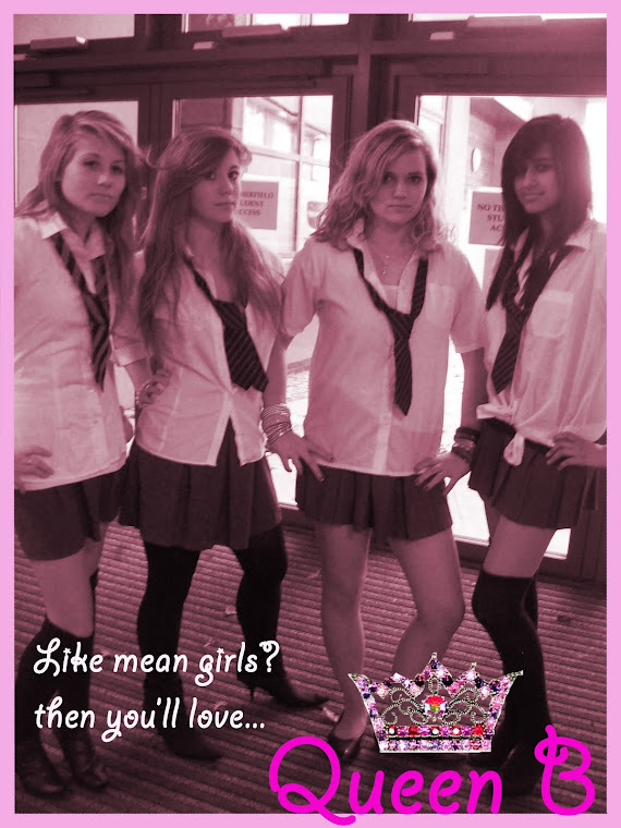
Shot 8: Shot 8 is the first time we see all of the characters interact with each other and also how they interact with our audience. When filming we really tried to get the point across to the audience that Lydia was the Queen B of the school and she ruled what happened within it. Jasmin and Ellouise were her minions and second in command and became Lydia's side kicks. We then came up with the formation of a triangle with Lydia at the front the two minions at her flanks. This is how we wanted to introduce the characters to the audience as we could show the relationship between them and focus on each character in turn. Natasha we wanted be separated from the Queen Bees as her story and appearance was different to the Queens. We changed her appearance in the uniform as very clean and tidy, in contrast to the 'slaggy' appearance of the Queen Bees. She again seems to stand separately from the Queens which sets her apart and allows our story to take place.
Shot 9: The titles that we wanted to include with the characters were displayed when the characters first appeared on the screen. We used the characters name followed by the actresses name. We left the titles on screen long enough for the audience to read and connect the name with the face. The titles were set at 'jaunty' angles to connote the fact that this was a 'hip and young, laid back' style of film setting the mood and tone. The titles also enter and disappear in time with the music and so the audience doesn't have to read them all at once but can take their time familiarising the characters. To keep in with continuity we used the same font, font colour and sizes.
By Hannah
No comments:
Post a Comment