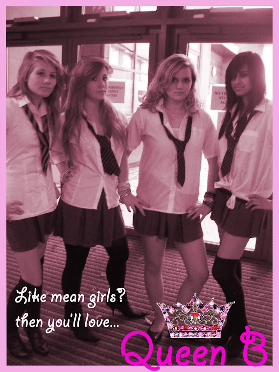
Above you can see the film poster that we have created, we have been able to use some of the shots from our film that we use towards the end, during the transformation scene to give an overall hint to the audience what our film content would be like.
Our main goal for creating our film poster was to put into our evaluation what we would use to sell our film, how we would attract the attention of our audience but also what type of audience that we wanted to attract. We used the pink which is the immediate eye catching point of the poster. The colour pink suggests certain feminine connotations within it and also the 'young girl' theme. The jewelled crown that we adapted from an original image found, we used to enhance the name 'Queen B' this gives an ironic humour to it, as it is not royalty that we are looking fro the name 'Queen' suggests, but the social hierarchy that our film is based around. Pink and curly writing also seem to extenuated the 'girlyness' of our film, really stereo-typing and profiling our audience which is really what we wanted, which was to have a broad range of features that generate a lot of interest within the public. The main picture within the poster are the four main characters of our film which show their power and presence within the film, the school uniform, hair & make-up all extenuated our mise-en-scene and show what our film is about 'life at school'.
By Hannah
Subscribe to:
Post Comments (Atom)
No comments:
Post a Comment